The Business of Fashion
Agenda-setting intelligence, analysis and advice for the global fashion community.
Agenda-setting intelligence, analysis and advice for the global fashion community.
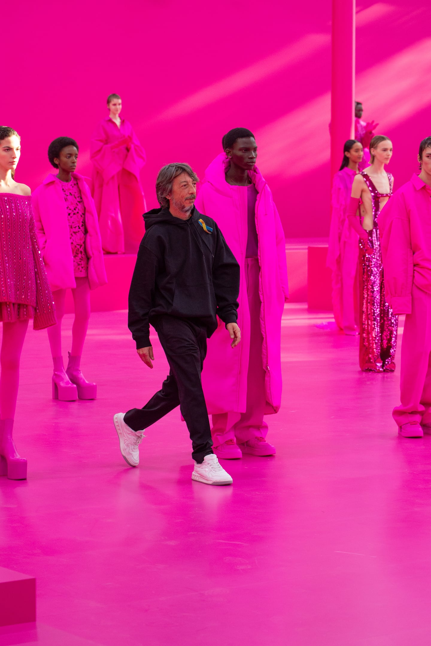
ROME — In 2022, as the coronavirus pandemic dragged on into its third year, Valentino designer Pierpaolo Piccioli started thinking about Lucio Fontana. Known for artfully slashing his canvases, the Italian artist often spoke of the act of cutting as a way of reaching into new worlds. Piccioli wondered if he could do that with colour.
“Colour is the most direct way to change perspectives, to challenge preconceived thoughts,” Piccioli told The Business of Fashion at a meeting in his Rome studio, housed in a Renaissance palazzo the brand has leased from the Vatican since 1967. “It’s searching to create another space, a sort of escape from reality.”
He ended up developing a signature hue for the Autumn/Winter 2022 season, now trademarked and catalogued in partnership with Pantone: a blistering hot pink shade that leans toward magenta, which he applied all over his Paris show space as well as 48 head-to-toe looks.
0 of 81
“I liked the way this colour doesn’t have any connotations: there’s blue, there’s red, a small bit of yellow. It’s sort of neon, but not. Pretty far away from the romanticism of pink,” he explained. “I wanted people to be transported, and then I could use it as a sort of black: your brain adjusts, and you start to focus on the shapes, the fabrics.”
ADVERTISEMENT
Following the March 2022 show, some in the audience complained that Valentino’s monomaniacal pink parade had felt like eating spoon after spoon of the same rich pastry. But for Valentino’s business, Piccioli’s new hue was a gift that kept on giving: the jolting shade ensured the brand’s products were instantly recognisable on the street, on Instagram and on the red carpet without relying on a logo. Sales climbed 15 percent to €1.4 billion ($1.5 billion) that year.
Best known for its signature red, since Piccioli was named sole creative director of Valentino in 2016 the brand has expanded its ambitions to become the luxury house most closely associated with the notion of colour more broadly. A spate of haute couture outings and blockbuster appearances on the awards season red carpet cemented the designer’s position: Piccioli mixed ever-more improbable shades of fuschia, mustard, mulberry and spearmint on the runway as well as dressing Lady Gaga in clouds of cotton candy and periwinkle for her appearances promoting “A Star Is Born.”
“Piccioli has made audacious colour work a signature,” fashion historian Alexandre Samson said. As a curator for the Palais Galliera museum in Paris, he advocated for the museum to acquire a fuschia gown and magenta feather hat from Valentino’s spring 2018 haute couture, which he saw as a “turning point for the brand.”
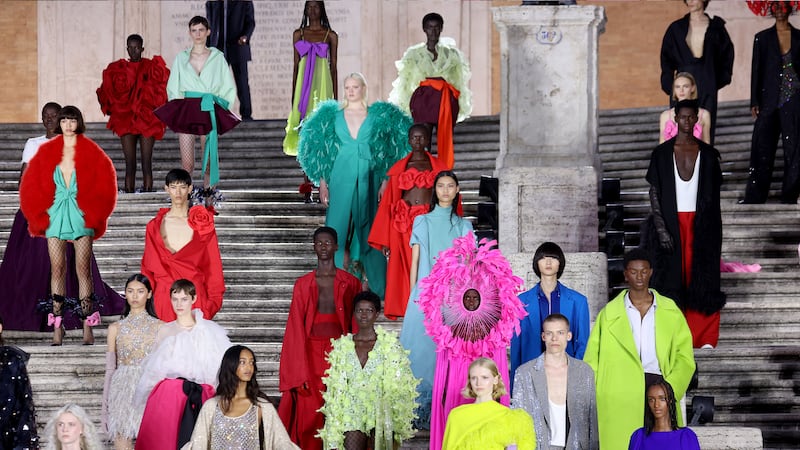
Piccioli has since secured a place in the pantheon of fashion’s great colourists, alongside figures like Yves Saint Laurent, Emilio Pucci, Christian Lacroix and Jean Patou, Samson said. “He truly masters certain ranges of colours,” notably off-tones like almond, eggplant, periwinkle and chartreuse that populate the in-between spaces on the colour wheel.
Following his triumphant return to the haute couture runway in 2021 following Italy’s strict pandemic lockdowns, The New York Times dubbed Piccioli fashion’s “best colourist since Yves Saint Laurent.”
Founder Valentino Garavani said of his signature hue, “red is not just a colour for Valentino. It is a non-fading mark, a logo.”
But Piccioli has taken Valentino’s use of red as a “playbook rather than a recipe,” Claire Gallon, a marketing consultant in Havas’ The Salmon unit, said. “He expresses the era’s emotion, moving from one colour to a palette that matches l’air du temps.”
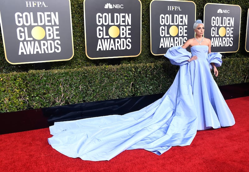
In the case of hot pink, the timing has been impeccable: making it seem a bit like the world’s recent Barbie-mania was his idea. Before that, Gaga’s periwinkle gown helped to usher in the lavender shades that have been described as “Gen Z purple,” the successor to “Millennial Pink.”
ADVERTISEMENT
For his menswear show this Saturday in Paris, titled “Le Ciel” (The Sky), Piccioli’s palette will include a new shade of blue: a dusty, electric hue that adds improbable heat to the colour wheel’s “cool” shade par excellence.
“I don’t like the social meaning of colours — ’red is sexy, black is dark, blue is masculine.’” Piccioli said. After his punchy pink — which had nothing girly about it — he wanted to identify shades that could re-contextualise colours traditionally seen as male-coded.
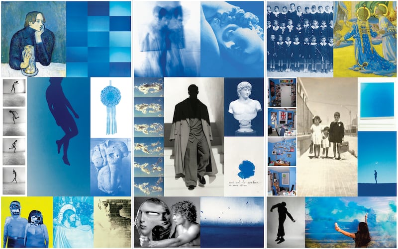
During a visit to the Mark Rothko retrospective currently on display in Paris, Piccioli admired the immediacy of the abstract expressionist’s use of colour — hues selected for their pure physical impact rather than any cultural associations.
“You look at this white, and there’s nothing peaceful about it,” he pointed out in 1958′s “White and Black on Wine.”
Piccioli doesn’t love being asked to label his palette: the names of many colours are insufficiently precise. In some of his more challenging compositions, to stray from his intended shade even a tiny bit would spell disaster. “You have to use at least two words,” he said.
In addition to the recent pink collection, other efforts to trickle the emerging code of strong seasonal colour choices into Valentino’s ready-to-wear collections have included a black-and-white theme for Autumn/Winter 2021′s “Act” collection, or Spring/Summer 2024′s line-up that mixed all-white looks with piney greens and deep oxbloods borrowed from the couture.
Still, the most audacious colour choices remain reserved for Valentino’s bi-annual haute couture outings: challenging palettes like Autumn/Winter 2023′s line up of cobalt rompers, cadmium brocade suits and neon cantaloupe trousers are destined to stay confined to the top-end, made-to-measure segment, where the brand is charged with crafting looks from head to toe and is aware of precisely who will be wearing it.
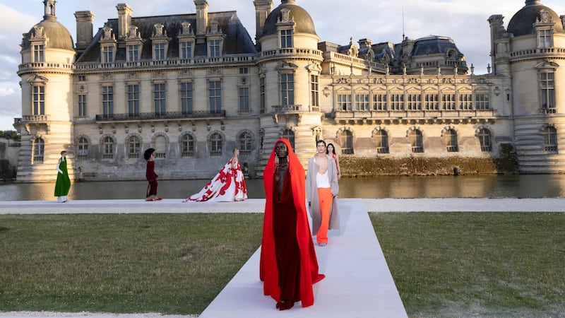
“Ready-to-wear is different, because it’s meant to be mixed and matched. Each item has to stand on its own,” Piccioli explained.
ADVERTISEMENT
Plus, “those fabrics are unthinkably expensive,” Samson points out. “You have to remember that the strength, the visual effect of a colour is intricately linked with how the fabric itself is woven. The colourimetry of haute couture is a very sophisticated art.”
“I love it when colour seems kind of bad taste. I love to try and work with colours I don’t like, or a vintage inspiration I think is ugly,” Piccioli said. “But in order for it to work, it has to look expensive.”
The result confirms sector-wide fears that luxury demand would continue to slow.
IWC’s chief executive says it will keep leaning into its environmental message. But the watchmaker has scrapped a flagship sustainability report, and sustainability was less of a focus overall at this year’s Watches and Wonders Geneva.
The larger-than-life Italian designer, who built a fashion empire based on his own image, died in Florence last Friday.
This week, designers, collectors and major fashion brands will flock to Milan’s design fair. Also, LVMH reports first-quarter sales.